Principal Component Analysis, or PCA, is one of the minor miracles of machine learning. It’s a dimensionality-reduction technique that reduces the number of dimensions in a dataset without sacrificing a commensurate amount of information. While that might seem underwhelming on the face of it, it has profound implications for engineers and software developers working to build predictive models from their data.
What if I told you that you could take a dataset with 1,000 columns, use PCA to reduce it to 100 columns, and retain 90% or more of the information in the original dataset? That’s pretty common, believe it or not. And it lends itself to a variety of practical uses, including:
- Reducing high-dimensional data to 2 or 3 dimensions so it can be plotted and explored
- Reducing data to n dimensions and then restoring the original number of dimensions, which finds application in anomaly detection and noise filtering
- Obfuscating datasets so they can be shared with others without revealing the nature or meaning of the data
And that’s not all. A side effect of applying PCA to a dataset is that less important features – columns of data that have less relevance to the outcome of a predictive model – are removed, while multicollinearity among columns is eliminated. And in datasets with a low ratio of samples (rows) to features (columns), PCA can be used to increase that ratio. As a rule of thumb, you typically want a dataset used for machine learning to have at least 5 times as many rows as it has columns. If you can’t add rows, an alternative is to use PCA to shave columns.
Once you learn about PCA, you’ll wonder how you lived without it. Let’s take a few moments to understand what it is and how it works. Then we’ll look at some examples demonstrating why it’s such an indispensable tool.
Understanding Principal Component Analysis
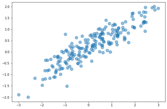
One way to wrap your head around PCA is to see how it reduces a 2-dimensional dataset to one dimension. The diagram below depicts a 2D dataset with a somewhat random collection of xs and ys. If you reduced this dataset to a single dimension by simply dropping the x column or the y column, you’d be left with a horizontal or vertical line that bears little resemblance to the original dataset.
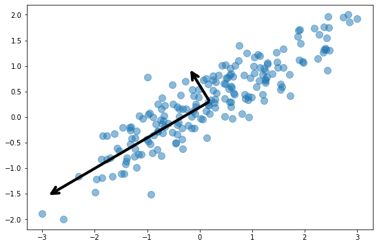
The next diagram adds arrows representing the dataset’s two principal components. Essentially, the coordinate system has been transformed so that one axis (the longer of the two arrows) captures most of the variance in the dataset. This is the dataset’s primary principal component. The other axis contains a narrower range of values and represents the secondary principal component. The number of principal components equals the number of dimensions in the dataset, so in this example, there are just two principal components.
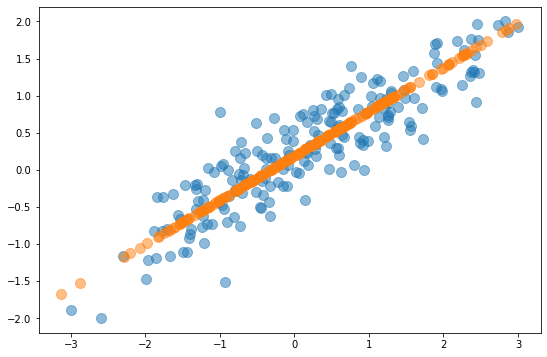
To reduce a 2-dimensional dataset to one dimension, PCA finds the two principal components and eliminates the one with less variance. This effectively projects the data points onto the primary principal component axis as shown below. The orange data points don’t retain all of the information in the original dataset, but they contain most of it. In fact, the PCAed dataset retains more than 95% of the information in the original dataset. PCA reduced the number of dimensions by 50%, but it sacrificed less than 5% of the meaningful information in the dataset. That’s the gist of PCA: reducing the number of dimensions without incurring a commensurate loss of information.
Under the hood, PCA works its magic by building a covariance matrix that quantifies the variance of each dimension with respect to the others, and from the matrix computing eigenvectors and eigenvalues that identify the dataset’s principal components. If you’d like to know more, I’d suggest reading A Step-by-Step Explanation of Principal Component Analysis. The good news is that you don’t have to understand the math to make PCA work because Scikit-learn’s PCA class does the math for you. The following statements reduce the dataset x to 5 dimensions, regardless of the number of dimensions it originally contains:
pca = PCA(n_components=5)
x = pca.fit_transform(x)
You can also invert a PCA transform to restore the original number of dimensions:
x = pca.inverse_transform(x)
The inverse_transform function restores the dataset to its original number of dimensions, but it doesn’t restore the original dataset. The information discarded when the PCA transform was applied will be missing from the restored dataset.
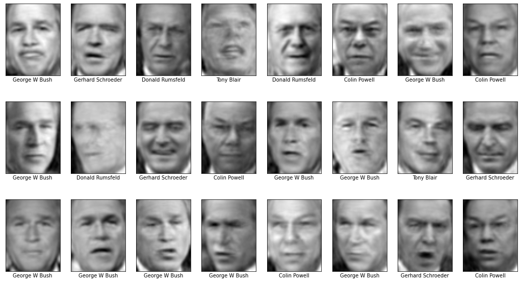
You can visualize this loss of information using the Labeled Faces in the Wild dataset featured in my previous post. To demonstrate, fire up a Jupyter notebook and run the following code:
from sklearn.datasets import fetch_lfw_people
import matplotlib.pyplot as plt
%matplotlib inline

faces = fetch_lfw_people(min_faces_per_person=100)
fig, ax = plt.subplots(3, 8, figsize=(18, 10))

for i, axi in enumerate(ax.flat):
    axi.imshow(faces.images[i], cmap='gist_gray')
    axi.set(xticks=[], yticks=[], xlabel=faces.target_names[faces.target[i]])
The output shows the first 24 images in the dataset:

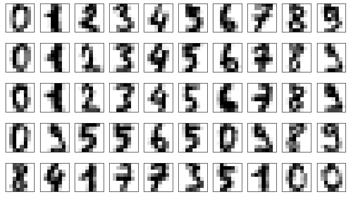
Each image measures 47×62 pixels for a total of 2,914 pixels per image. That means the dataset has 2,914 dimensions. Now use the following code to reduce the number of dimensions to 150 (roughly 5% of the original number), restore the original 2,914 dimensions, and plot the restored images:
from sklearn.decomposition import PCA

pca = PCA(n_components=150, random_state=0)
pca_faces = pca.fit_transform(faces.data)
unpca_faces = pca.inverse_transform(pca_faces).reshape(1140, 62, 47)

fig, ax = plt.subplots(3, 8, figsize=(18, 10))

for i, axi in enumerate(ax.flat):
    axi.imshow(unpca_faces[i], cmap='gist_gray')
    axi.set(xticks=[], yticks=[], xlabel=faces.target_names[faces.target[i]])
Even though you removed almost 95% of the dimensions in the dataset, little meaningful information was discarded. The restored images are slightly blurrier than the originals, but the faces are still recognizable:
To reiterate, you reduced the number of dimensions from 2,914 to 150, but because PCA found 2,914 principal components and removed the ones that are least important (the ones with the least variance), you retained the bulk of the information in the original dataset. Which begs a question: precisely how much of the original information was retained?
After a PCA object is fit to a dataset, you can find out how much variance is explained by each principal component from the explained_variance_ratio_ attribute. It’s an array with one element for each principal component in the reduced dataset. Here’s how it looks for the transformed dataset above:
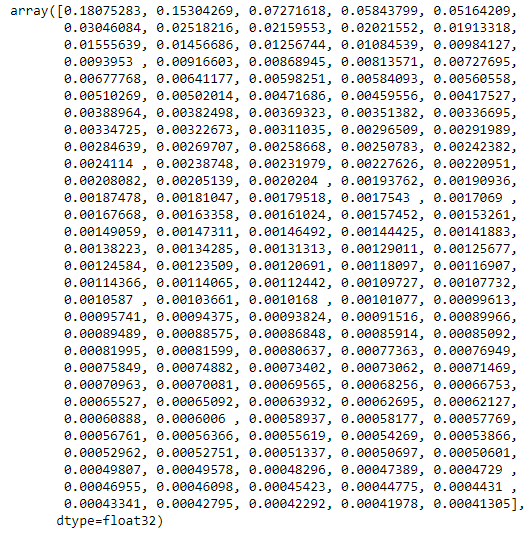
This tells us that 18% of the variance in the dataset is explained by the primary principal component, 15% is explained by the secondary principal component, and so on. Observe that the numbers decrease as the index increases. By definition, each principal component in a PCAed dataset contains more information than the principal component after it. In this example, the 2,764 principal components that were discarded contained so little information that their loss was barely noticeable when the transform was inverted. In fact, the sum of the 150 numbers above is 0.9480211. This means that reducing the dataset from 2,914 dimensions to 150 retained 94.8% of the information in the original dataset. In other words, you reduced the number of dimensions by almost 95%, and yet you retained almost 95% of the information in the dataset. If that’s not awesome, I don’t know what is.
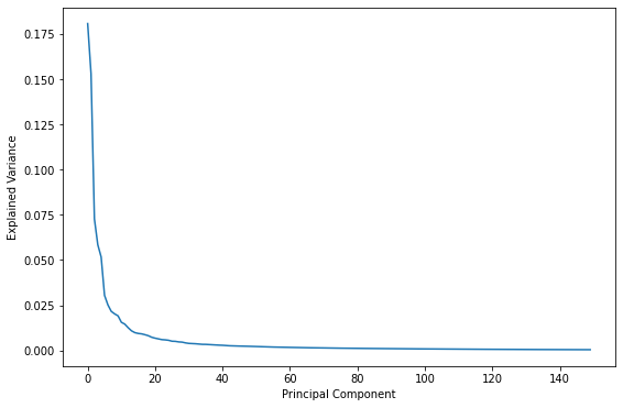
A logical question to ask is what is the “right” number of components? In other words, what number of components strikes the best balance between reducing the number of dimensions in the dataset and retaining most of the information? One way to answer that question is a scree plot, which charts the proportion of explained variance for each dimension. Here’s a scree plot for the PCA transform used on the facial images:
plt.plot(pca.explained_variance_ratio_)
plt.xlabel('Principal Component')
plt.ylabel('Explained Variance')
Another way to look at it is to plot the sum of the variances as a function of component count:
import numpy as np

plt.plot(np.cumsum(pca.explained_variance_ratio_))
plt.xlabel('Number of Components')
plt.ylabel('Cumulative Explained Variance');
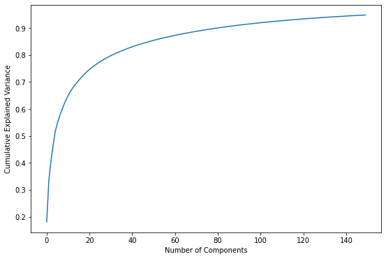
Either way you look at it, the bulk of the information is contained in the first 50 to 100 dimensions. Based on these plots, if you reduced the number of dimensions to 50 instead of 150, would you expect the restored facial images to look substantially different? If you’re not sure, try it and see.
Putting PCA to Work: Noise Reduction
One practical use for PCA is filtering noise from data. The basic approach is to PCA-transform the dataset and then invert the transform, taking the dataset from m dimensions to n and then back to m. Because the information that is discarded is the least important information and noise tends to have little informational value, this will ideally eliminate most noise while retaining most of the meaningful information.
You can test this supposition with the optical recognition of handwritten digits dataset included with Scikit-learn. That dataset contains 1,797 samples of scanned, handwritten digits. The samples are roughly evenly divided among 10 classes corresponding to the digits 0 through 9. Each digit is represented by an 8×8 array of pixel values, so the dataset contains 64 dimensions. Start by loading the dataset and showing the first 50 images:
from sklearn.datasets import load_digits
import matplotlib.pyplot as plt
%matplotlib inline

digits = load_digits()
fig, axes = plt.subplots(5, 10, figsize=(12, 7), subplot_kw={'xticks': [], 'yticks': []})

for i, ax in enumerate(axes.flat):
    ax.imshow(digits.images[i], cmap=plt.cm.gray_r)
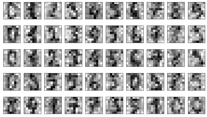
Next, use a random-number generator to introduce noise to the dataset and plot the results:
import numpy as np

np.random.seed(42)
noisy = np.random.normal(digits.data, 4)
fig, axes = plt.subplots(5, 10, figsize=(12, 7), subplot_kw={'xticks': [], 'yticks': []})

for i, ax in enumerate(axes.flat):
    ax.imshow(noisy[i].reshape(8, 8), cmap=plt.cm.gray_r)
Now use PCA to reduce the number of dimensions. Rather than specify the number of dimensions (components), we’ll specify that we want to reduce the amount of information in the dataset to 50%. We’ll let Scikit decide how many dimensions will remain, and then show the number:
from sklearn.decomposition import PCA

pca = PCA(0.5, random_state=0).fit(noisy)
pca.n_components_
PCA reduced the number of dimensions from 64 to 12, but the 12 remaining dimensions contain 50% of the information in the original 64. Now reconstruct the dataset from the reduced version:
pca_digits = pca.transform(noisy)
unpca_digits = pca.inverse_transform(pca_digits)

fig, axes = plt.subplots(5, 10, figsize=(12, 7), subplot_kw={'xticks': [], 'yticks': []})

for i, ax in enumerate(axes.flat):
    ax.imshow(unpca_digits[i].reshape(8, 8), cmap=plt.cm.gray_r)
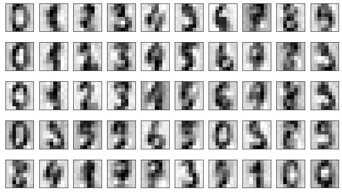
The reconstructed dataset isn’t quite as clean as the original, but it’s clean enough that you can make out most of the numbers.
Visualizing High-Dimensional Data
Another practical use for PCA is reducing a dataset down to 2 or 3 dimensions so it can be plotted with libraries such as Matplotlib. You can’t plot a dataset that has 1,000 columns. You can plot a dataset that has 2 or 3 columns. The fact that PCA can reduce high-dimensional data to 2 or 3 dimensions while retaining much of the original information makes it a great tool for exploring data and visualizing relationships between classes.
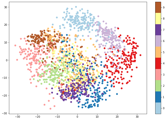
Suppose you are building a classification model and would like to get some idea up front whether there is sufficient separation between classes to support a classifier. Take the digits dataset used in the previous example. If you could plot a 64-dimensional diagram, you might be able to inspect the dataset looking for separation between classes. But 64 dimensions is 61 too many for most humans.
Enter PCA. The following code loads the digits dataset, uses PCA to reduce it to 2 dimensions, and plots the result, with different colors representing different classes:
from sklearn.decomposition import PCA
from sklearn.datasets import load_digits
import matplotlib.pyplot as plt
%matplotlib inline

digits = load_digits()
pca = PCA(n_components=2, random_state=0)
pca_digits = pca.fit_transform(digits.data)

plt.figure(figsize=(12, 8))
plt.scatter(pca_digits[:, 0], pca_digits[:, 1], c=digits.target, cmap=plt.cm.get_cmap('Paired', 10))
plt.colorbar(ticks=range(10))
plt.clim(-0.5, 9.5)
The resulting plot provides an encouraging sign that we might be able to build a classifier around the data. While there is clearly some overlap between classes, the different classes form rather distinct clusters. There is significant overlap between red (the digit 4) and light purple (the digit 6), indicating that a model might have some difficulty distinguishing between 4s and 6s. 0s and 1s, however, lie at top and bottom, while 3s and 4s fall on the far left and far right. A model would presumably be proficient at telling these digits apart.
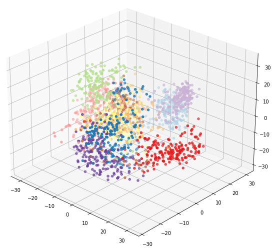
You can better visualize relationships between classes with a 3D plot. The following code uses PCA to reduce the dataset to 3 dimensions and Mplot3D to produce an interactive plot:
%matplotlib notebook
from mpl_toolkits.mplot3d import Axes3D

digits = load_digits()
pca = PCA(n_components=3, random_state=0)
pca_digits = pca.fit_transform(digits.data)

ax = plt.figure(figsize=(12, 8)).add_subplot(111, projection='3d')
ax.scatter(xs = pca_digits[:, 0], ys = pca_digits[:, 1], zs = pca_digits[:, 2], c=digits.target, cmap=plt.cm.get_cmap('Paired', 10))
You can use your mouse to rotate the resulting plot in 3D dimensions and look at it from different angles. Here we can see that there is more separation between 4s and 6s than was evident in 2 dimensions:
PCA isn’t the only way to reduce a dataset to 2 or 3 dimensions for plotting. You can also use Scikit’s Isomap class or its TSNE class. TSNE stands for t-distributed stochastic neighbor embedding, or t-SNE for short. t-SNE is a dimensionality reduction algorithm that is almost exclusively used for visualizing high-dimensional data. Whereas PCA uses a linear function to transform data, t-SNE uses a non-linear transform that tends to heighten the separation between classes by keeping similar data points close together in low-dimensional space. (PCA, by contrast, focuses on keeping dissimilar points far apart.) Here’s an example that plots the digits dataset in 2 dimensions after reduction with t-SNE:
%matplotlib inline
from sklearn.manifold import TSNE

digits = load_digits()
tsne = TSNE(n_components=2, random_state=0)
tsne_digits = tsne.fit_transform(digits.data)

plt.figure(figsize=(12, 8))
plt.scatter(tsne_digits[:, 0], tsne_digits[:, 1], c=digits.target, cmap=plt.cm.get_cmap('Paired', 10))
plt.colorbar(ticks=range(10))
plt.clim(-0.5, 9.5)
And here is the output:
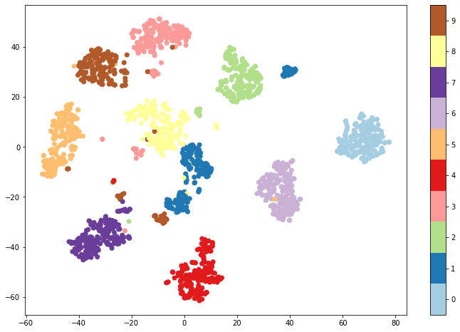
You can see that t-SNE does a better job of separating groups of digits into clusters, indicating there are patterns in the data that machine learning can exploit. The chief drawback is that t-SNE is compute-intensive, which means it can take a prohibitively long time to run on large datasets. One way to mitigate that is to run t-SNE on a subset of rows rather than the entire dataset. Another strategy is to use PCA to reduce the number of dimensions, and then subject the PCAed dataset to t-SNE.
Get the Code
You can download a Jupyter notebook containing the examples in this post from the machine-learning repo that I maintain on GitHub. Feel free to check out the other notebooks in the repo while you’re at it. Also be sure to check back from time to time because I am constantly uploading new samples and updating existing ones.