In the last post, we created APIs for our machine learning models so they could be deployed and clients could invoke them. However, what if you just wanted a simple web page that included interactive and attractive graphs? That’s where Dash comes to the rescue.
Dash is similar to Shiny, a framework to build interactive web apps in R, but we’ll be creating a web app in Python. We will look at some easy ways to build custom dashboards for your models and data.
In this post, we’ll go over some of the basics of Dash and create a small web page that we can use to make predictions from our simple linear regression model that we’ve created in a previous post. We will review some Dash’s graphing utilities used for creating visuals of our data.
As always, the code from this post is on GitHub.
Dash Basics
To get started with Dash, you first need to install it with pip.
pip install dash
pip install dash-renderer
pip install dash-html-components
pip install dash-core-components
pip install plotly
Once all packages are installed, create a new Python script. Add in the imports for the packages installed. Since we’ll be accessing our model, we’ll also add an import for scikit-learn‘s joblib that we will be using later. Dash is built off of Flask so we can start the server in a similar way by creating an instance of the Dash class as app and call the run_server method on it if the script is called directly.
import dash
import dash_core_components as dcc
import dash_html_components as html
from dash.dependencies import Input, Output
from sklearn.externals import joblib
import plotly.graph_objs as go

app = dash.Dash()

if __name__ == '__main__':
    app.run_server(debug=True)
HTML Layout
Underneath the code that was used to initialize the Dash app we can create the app layout. The layout is where all of our HTML components will go. If we assign the layout to an empty div and run this, the result will be that a locally executed web server will serve up a blank page. So let’s add some HTML to our layout.
app.layout = html.Div(children=[
    html.H1(children='Simple Linear Regression', style={'textAlign': 'center'}),

    html.Div(children=[
        html.Label('Enter years of experience: '),
    ], style={'textAlign': 'center'}),
])
The dash_html_components package has a collection of HTML controls that we can use. If you don’t find a control you are looking for or you need to customize a control, you can always build your own with React.js. There’s an optional style parameter where you can add a dictionary of CSS styles values.
Static HTML is cool… if we were back in the 90’s. But what we need is some interactivity, especially if we’re going allow users to interact with our models which requires input.
Input
Input is just as easy as adding HTML with the dash_core_components package. I’ll just add an input control right after the label.
dcc.Input(id='years-of-experience', placeholder='Years of experience', type='text')
You may have noticed that the parameter names are the same as the HTML attributes, which makes translating from HTML to the Dash controls easy.
Later we’ll look at how to handle the input with callbacks in order to call our model, but for now, let’s leave things as they are.
Graphs
Implementing graphs is what makes Dash standout from making this type of web page manually. With the help of the plotly.graph_objs package we can create all sorts of graphs to display data to our users and to help drive business decisions.
Dash, with the power of Plotly behind it, can do much more than just display simple graphs. It can make the graphs interactive. This interactivity allows users of the Dash app to be able to explore the data in much more detail to help answer their questions in ways a simple graph never could.
You can hover over the points for exact coordinates.

There are also a ton of options for further refining the view of the graph to get more detail. In the above GIF, you may notice a toolbar in the top right.

That gives you access to a few tools to assist in exploring the data further.
Now that we have a basic idea of what we can build with Dash, let’s implement our model to make predictions and to show our scatter plot of data.
Implementing our Model
Similar to our previous post, we’ll use joblib from scikit-learn to load our model. Let’s update our if statement to check if the __name__ variable is __main__, and if that is true, we load the model.
if __name__ == '__main__':
    model = joblib.load("./linear_regression_model.pkl")
    app.run_server(debug=True)
Now, let’s implement the callback to our input we added earlier.
Input Callback
Dash handles user interactivity with callbacks which are represented by a method decorator denoted by @app.callback(). In here you give it an Output to tell where the output should go. We have our output going to a component with an id of result. We also give it an Input, which is enclosed in brackets ([]) since we can have multiple input values. In our example, we provide it with the ID of the years-of-experience input control we added earlier.
In our function declaration, since we only get one input, we put one parameter. The number of inputs will be the same number of parameters in our function declaration.
Here’s the skeleton of what this would look like. To keep the IDE from yelling at us about an empty function, we utilize the pass keyword which indicates to the IDE to take no action.
@app.callback(
    Output(component_id='result', component_property='children'),
    [Input(component_id='years-of-experience', component_property='value')])
def update_years_of_experience_input(years_of_experience):
    pass
Now let’s add the body of the function to call the model with our input.
@app.callback(
    Output(component_id='result', component_property='children'),
    [Input(component_id='years-of-experience', component_property='value')])
def update_years_of_experience_input(years_of_experience):
    if years_of_experience is not None and years_of_experience is not '':
        try:
            salary = model.predict(float(years_of_experience))[0]
            return 'With {} years of experience you should earn a salary of ${:,.2f}'.                format(years_of_experience, salary, 2)
        except ValueError:
            return 'Unable to give years of experience'
In the function we do a check on our years_of_experience parameter to make sure it’s not None (no input) or empty. Then, in a try block, we call the predict method on our model. Since years_of_experience comes in as a string we must parse it to a float for our model. Then, because the output is in a numpy array with only one value, we just take the value out of the array. We return from the method with a string that indicates what our model predicted.

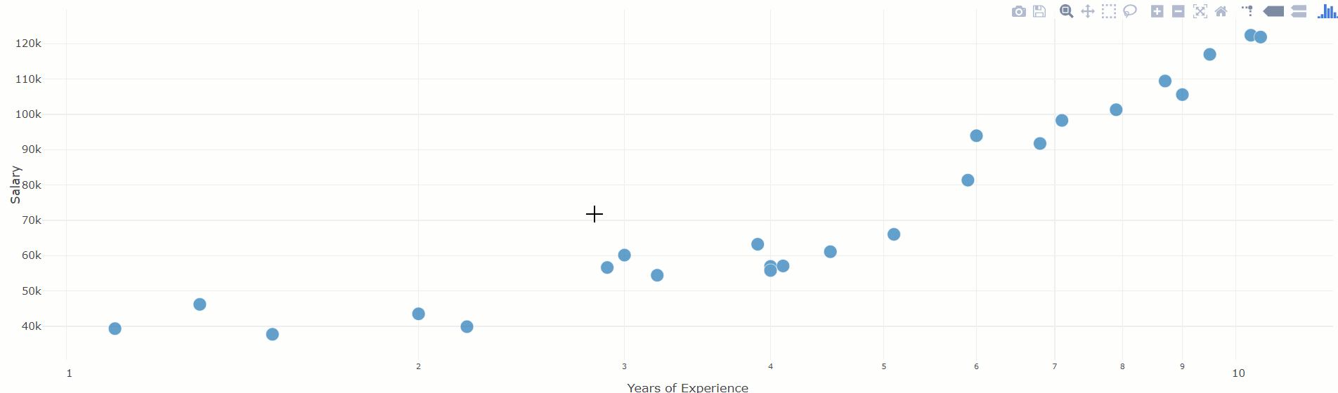
Scatter Plot for Current Data
To finish off our web app, we can add in a scatter plot of the data that we currently have to let the user see the raw data.
In order to use the data, we need access to it. To keep it simple, let’s just load the data after instantiating the Dash app.
training_data = joblib.load("./training_data.pkl")
training_labels = joblib.load("./training_labels.pkl")
Graphs are added to the layout where we added our other HTML elements and we use the Graph component provided by dash_core_components. From dash_core_components select the plotly.graph_objs component to specify we want a scatter plot.
dcc.Graph(
        id='scatter-plot',
        figure={
            'data': [
                go.Scatter(
                    x=training_data['YearsExperience'],
                    y=training_labels,
                    mode='markers',
                    opacity=0.7,
                    marker={
                        'size': 15,
                        'line': {'width': 0.5, 'color': 'white'}
                    },
                )
            ],
            'layout': go.Layout(
                xaxis={'type': 'log', 'title': 'Years of Experience'},
                yaxis={'title': 'Salary'},
                margin={'l': 40, 'b': 40, 't': 10, 'r': 10},
                hovermode='closest'
            )
        }
    )
As you may have noticed, we set the x and y values of the graph as well as other visual aspects while declaring the graph element. In the layout of the graph, we specify axes titles, adjust the type of markers and change the opacity as much as we need.
With this introduction to Dash, we learned how to set up our machine learning models to easily create web apps. These web apps can then be deployed and used by others to help them explore data intelligently and make more informed business decisions.